
Nine Reviews
West Side and Melrose Hill

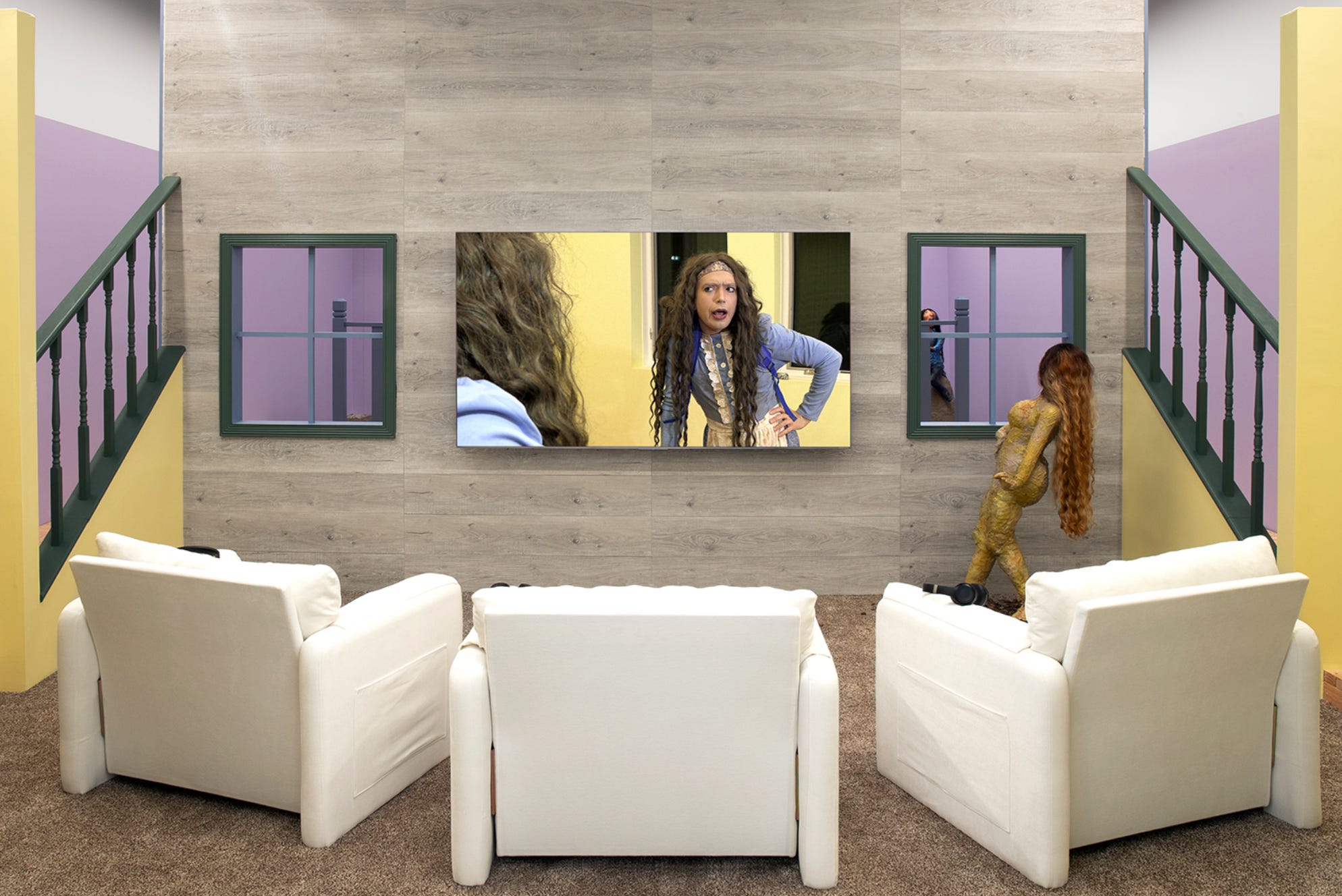
Ryan Trecartin and Lizzie Fitch’s “Ply Would” at Moran Moran
February 21 - April 18, 2026
4.5 Stars
What would you do if you basically invented “The Internet” or at least put your finger on its pulse before anyone else did? Trecartin and Fitch’s work felt prophetic the moment it was born and recent history has confirmed this. Reality feels more and more like Trecartin’s world, day by day. But then what? Here, Trecartin and Fitch journey to the heartland and stand around in corn fields and autumnal woods doing their scizo-dada-ist shtick as folksy dustbowl characters. The fact that we’re all cyborgs is by now a moot point so the make-up and sets are more subdued—you don’t need to underline that these days—but the rapid fire cuts still echo what it’s like to scroll through Tik Tok/IG Reels. But, y’know, more-so. And weirder: a shambolic condensation of the polyphonic hive mind. Ok, don’t ask me what happens when you condense a shambles. This body of work is concerned with the notion of Rural American “Authenticity” as a hyperreal simulacrum. Ironically, the ostensibly normative baseline which everything else is defined against is, like, maybe even the fakest thing ever. Even the Trad Wives are Cyborgs now. JK, they always were. And so, as DivaCorp might ask “what does this have to do with Clavicular”? Well, the straight boys are taking diet pills, doing body mods, and sublimating their desires into clickbait. Gender truly is a construct. Self-presentation is drag. Everybody transgender now!!!
Note: a lot of his videos are available on Vimeo (and probably elsewhere) including excerpts from the pieces in this show. So, if you can’t make it to Moran Moran by April 18th you can still experience a good portion of his work online. It’s worth your time. The installations are mostly just accoutrements for the videos anyway.
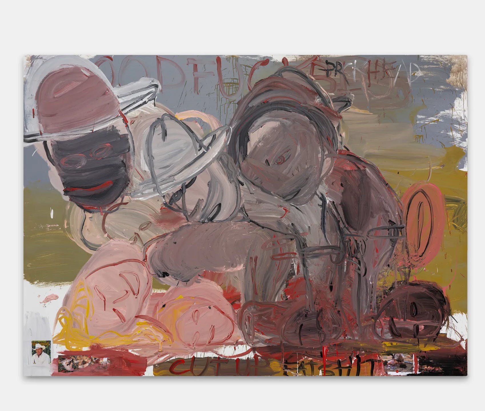
Raymond Sanders’s “Notes” at David Zwirner
February 24 - April 25, 2026
3.5 Stars
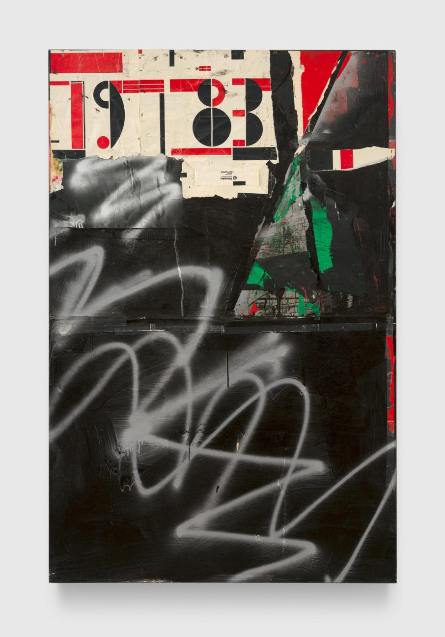
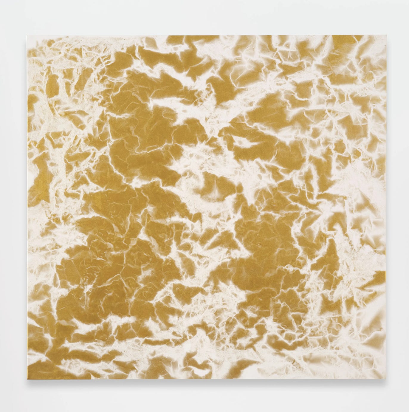
This show achieves something fascinating which is an inventive extrapolation on Johns and Rauschenberg. It manifests their penchant for heterogeneity buttressed with intense specificity but for a different cultural moment and from a different viewpoint, one which feels prescient. That is, Rauschenberg invented a kind of heterogeneity/contradiction as rigorous method but it was also always indexed to a baseline of Americana. Sanders’ paintings have that kind of Bob Rauschenberg quality of Everything And The Kitchen Sink and not-to-mention The-Sears-and-Roebuck-advertisement-for-kitchen-sinks thrown in for good measure but he understands—intuitively, as a black man, perhaps—that the baseline of American normativity/pop/what-have-you had either evaporated or never existed in the first place. Consequently: his heterogeneity is weirdly EVEN MORE heterogeneous. The appropriated elements tend to be less “iconic” except, of course, when they are, or they are but in ways which are, themselves, off-center. Iconicity is a moving target. The image above kind of encapsulates this for me: that recognizably high-modernist font is actually quite weird and nicely juxtaposed with nine-ish square feet of IDGAF. Rauschenberg might put a pictures from Time or Life in his combines (like the marathon runner in Rebus, for instance) but it’s hard to imagine him using covers of Time Magazine and Newsweek featuring the Unabomber.
Sanders’ painterly methods run the full gamut from representational renderings of fruit, gridded squares, haphazardly pasted magazine pages, to five seconds of spray silver paint zig-zagging across the whole thing. The rigorously formal compositions—you can tell that there’s a sense of an underlying grid—hold together so many diverse elements that their centrifugal force, their resistance to resolution, might almost escape you. Maybe this work is just a gloss on Rauschenberg/Johns but it’s an illuminating one.
Jack Pierson’s “Curtains” at Regen Projects
March 12 - April 18, 2026
3.5 Stars
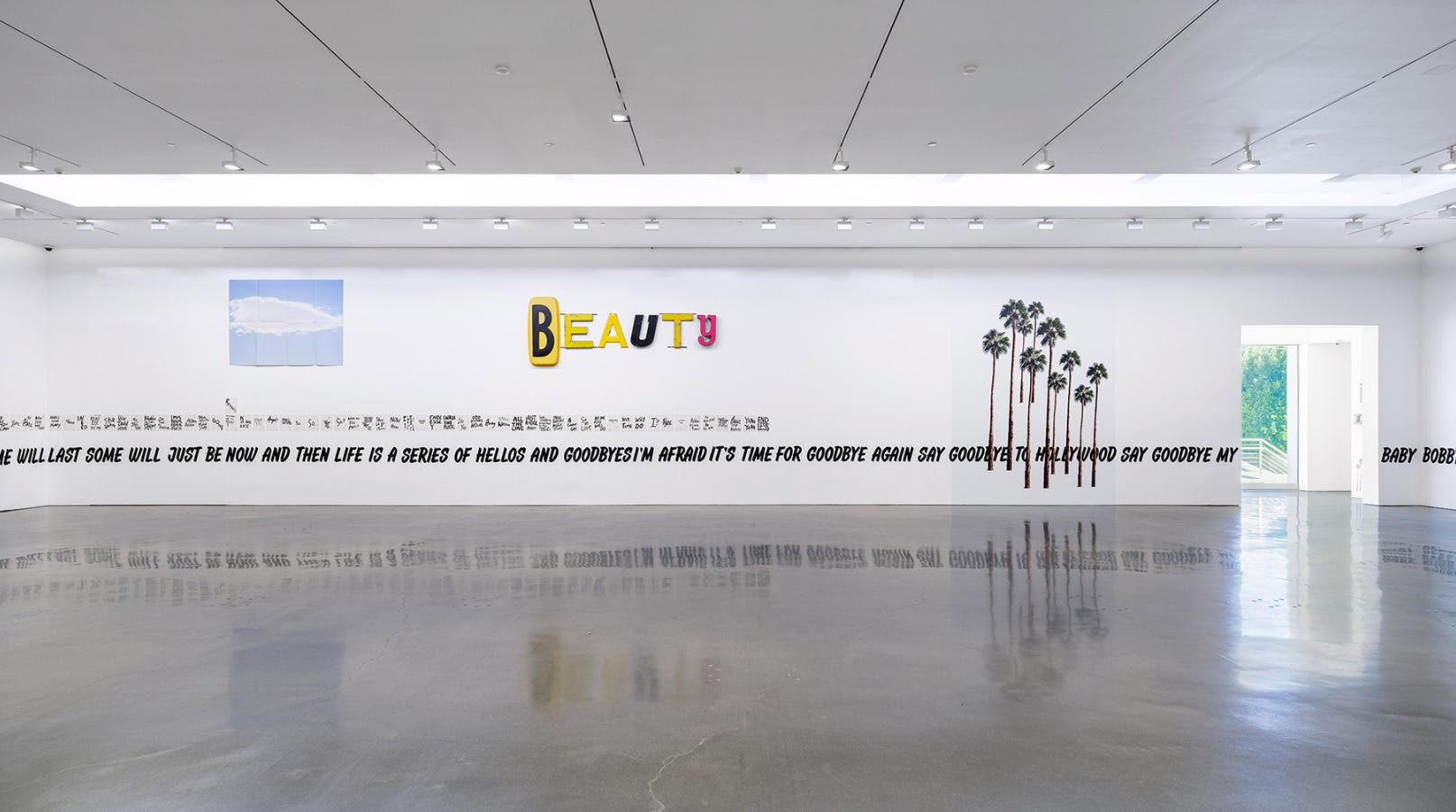
The principle gimmick here of using mismatched store signage letters, ransom note style, to make funny little phrases, cute jokes (“HOMOS ONLY”), and vaguely profound sayings doesn’t seem, conceptually, like it should be this good but it’s surprisingly satisfying. The linguistic quality holds their heterogeneity together while the disjunctive letters each, still, speak to and echo their diverse origins—as if pushing back against the imposed linguistic uniformity, at odds with their imposed order. The phrases themselves have a banal found quality which helps. The weathered surfaces add a level of visual interest which speaks to the unique histories and origins of each and every letter. The selection of letters all seem precisely chosen to color their composite phrase. It’s actually hard to believe that these work as well as they do. Sometimes art is a mystery, I guess. This show is a testament to how thin the line is between kitsch and Art. The installation here includes text pieces, drawings, and some “kitschy” mirror/neon pieces which all work great together. Is this, actually, an “installation” or just excellence in curating. Either way, this is an inventive exhibition format. That and I saw John Waters at the opening which is fun. We love that guy.
Arshille Gorky’s “Horizon West” at Hauser and Wirth
February 21 - April 25, 2026
3.5 Stars
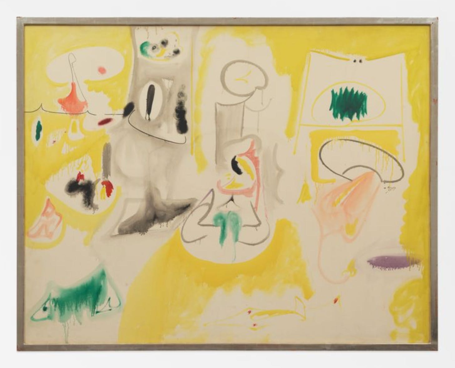
It’s nice when LA gets this kind of historical show which you can generally trip over in New York City (See also: Milton Avery, below). This one is uneven but still revealing. The earlier work gives the impression that Gorky, before he found himself, was a good artist but ultimately of his time. A bunch of these feel or would feel like period manifestations of a style (decent-to-excellent biomorphic surrealism) if he wasn’t Gorky (pre-1940’s, more or less). Once he hits his stride though it’s gangbusters. What’s interesting is that the video here kind of indicates that this quintessentially New York School Artist might have been largely shaped by a trip to the southwest—which explains how his flavor of biomorphic quasi-landscape post-Cubist abstraction can feel like of combination of prickly cactuses and rounded boulders against the big sky of the vast plains.
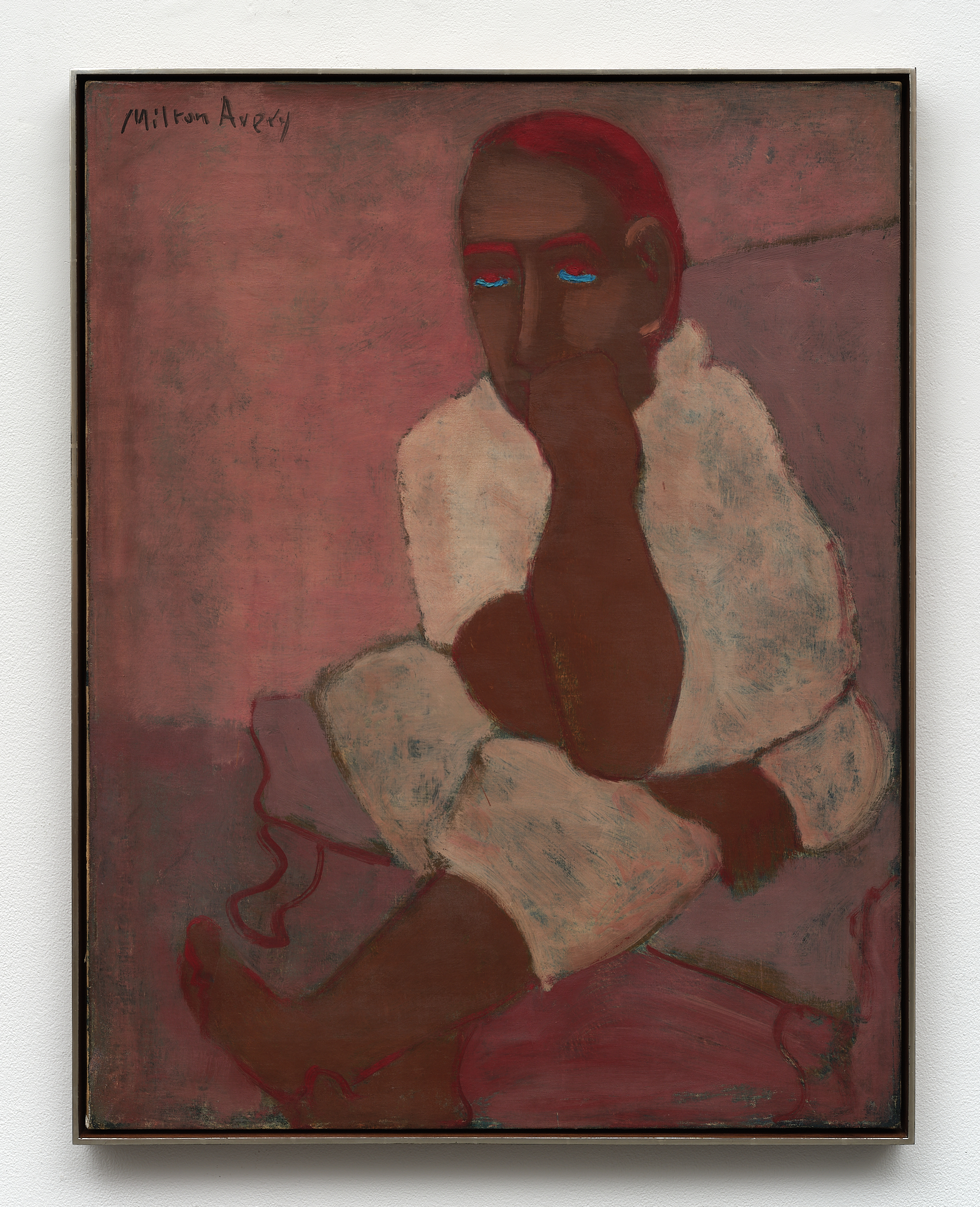
Milton Avery “The Figure” at Karma Gallery
February 21 - April 11, 2026
4.5 Stars
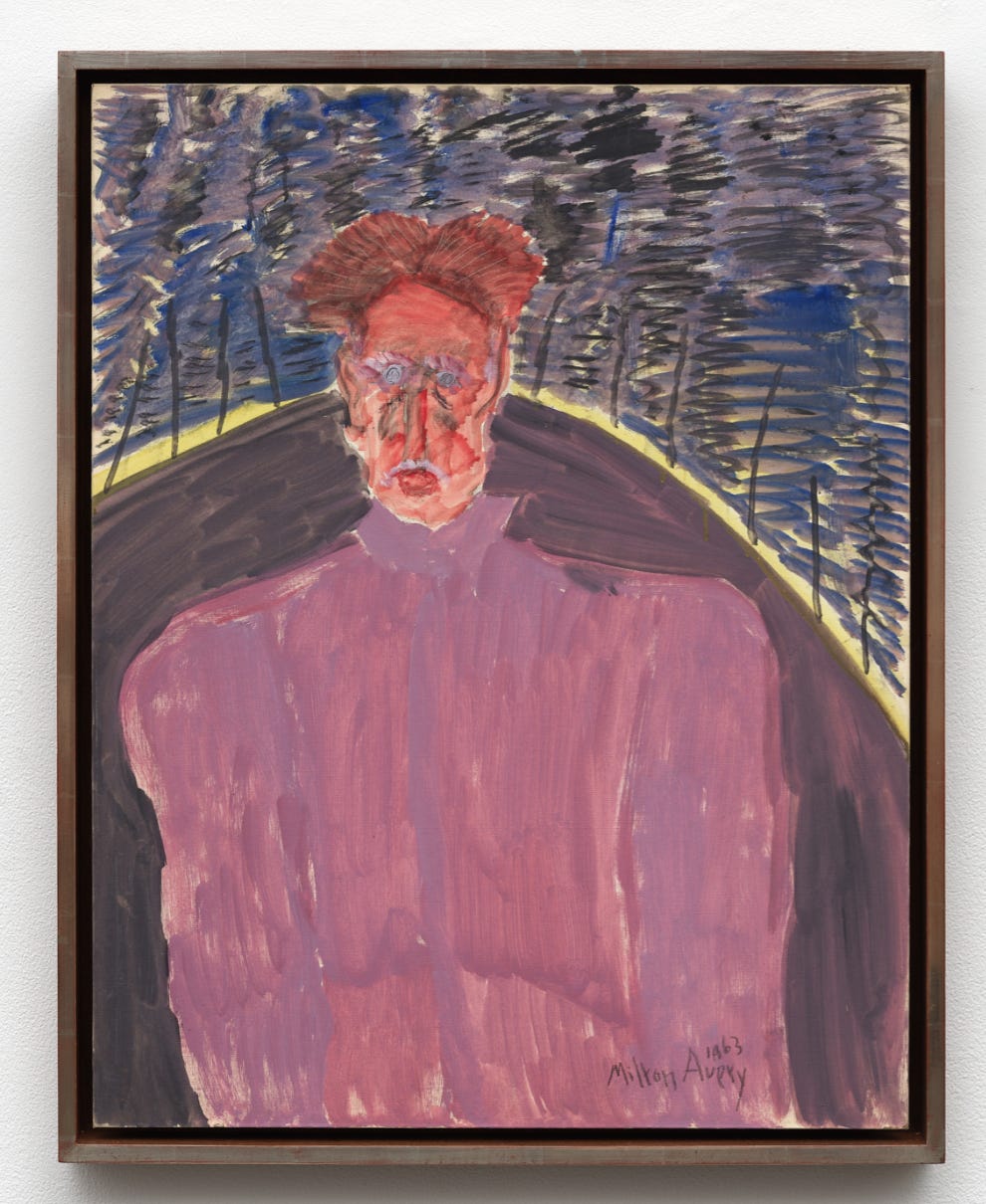
Same thing as I said in the first sentence of the Gorky review above but even more-so. Not just a great historical show but one which indicates that Avery—who we might regard as a canonical but second tier artist was actually pretty great. This is the best type of historical art show that one can see: one which exposes one to an entire aesthetic universe which had otherwise gone unnoticed and uncanonized. By doing so it reshapes our narrative of art history.
His color sensibility is itself incredibly original. All the colors appear to be dulled down but also luminous—like seeing brightly colored materials in the dark. This precise control of color contrasts locks everything into an atmospheric space despite the pared down renderings and extreme distortions. The relative simplicity of the compositions and figuration make everything feel absolutely locked in. The level of restraint also allows the color and facture to shine through, every brushstroke matters while never becoming fussy, precious, or ostentatiously loose. The background in Untitled (Rose Portrait) (1930), for instance, has the luminosity and open brushwork of a Rothko with the added bonus of the iridescent, incantatory eyes. In cases, the portraiture can seem a little bit over-simplified and cartoonish but there’s a fine line there when reductionist simplicity is the point. This is just great painting with no extra additives, fillers, or artificial preservatives: art pared down to the essential ingredients.
Paul McCarthy’s “CSSC, Coach Stage Stage Coach, A&E, Adolf/Adam & Eva/Eve, Samples” at The Journal Gallery
February 23 – April 25, 2026
2.5 Stars
Basically a pretty weak show for a major artist/One of the Greats/One of my personal faves. The paintings manifest his typical transgressive chaotic uncontainable energy. Make no mistake, these are actually ART in a way that a lot of paintings aren’t. BUT: ultimately, he’s not really a painter. His work tends to be good insofar as it manifests an energy which is essentially linked to performance art. So, the paintings have that intensity but without the specificity that painting requires. It’s actually impressive that he’s this good at something he’s bad at. The sculptures are better but (partly) suffer the same fate, they feel like ephemera or second order fragments of a larger enterprise. The head of A&E, A/A Murder E/E Suicide, (2022) is amazing though. This is, to say the least, an interesting take on Hitler’s suicide. It reminds me of how Kathy Griffin got in big trouble for her Vanity Fair cover of a decapitated Trump: a classic case of “too soon!” Good for her though. Fuck the haters. Here, the literally dirty clothes and violently wounded faces convey the sense they these are dead bodies which might have been found in a ditch and then put on a gurney at the coroner’s office. The art market seems to demand paintings from artists who aren’t really painters which is sad. See also: the Sarah Sze show at Gagosian which I just wrote about.
Berta Fischer’s “Berta Fischer” at James Fuentes
February 21 - Apr 2, 2026
1 Stars
OoooOOOOoooh shiny. Just kidding. We can be more generous than that although I don’t see why we should have too. It’s funny to note that Fischer is a German since this feels like off-brand west coast “Light and Space” Minimalism, albeit in its stupidest most Vegas-y manifestation. This is just Kirkland-ass Fred Eversley meets late John Chamberlain. LA practically invented shallow as virtue and no one can do it better than us: least of all, the Germans. That said, these present as superficial but it lacks the attention to phenomenological specificity which makes this type of thing work—as in, say, Larry Bell , Fred Eversley, Mary Corse, or Robert Irwin. They don’t make their spectacular material (plexi-glass) sing the song of ourselves, they just make shapes with shiny stuff. Not. Shallow. Enough.
Vicky Colombet’s “Eutierria” at Fernberger
February 21 - April 4, 2026
1 Star
These look like that trick like how when you crumple up paper and then spray paint it which creates an illusion of crumpled fabric when unfolded—kind of like tie-dye. But, oddly, they are not process art. This makes them trompe l’oeil which is the only thing worse than process art. The colors are very seductive and shiny, including some metallic paints, which would be interesting if the colors mattered at all and weren’t purely disconnected and secondary to the structure she’s producing. That is, these just achieve the average baseline of attractive all-over abstraction and otherwise do nothing.
Ellsworth Kelly’s “The Naming of Colors” at Matthew Marks
through April 11, 2026
3 Stars
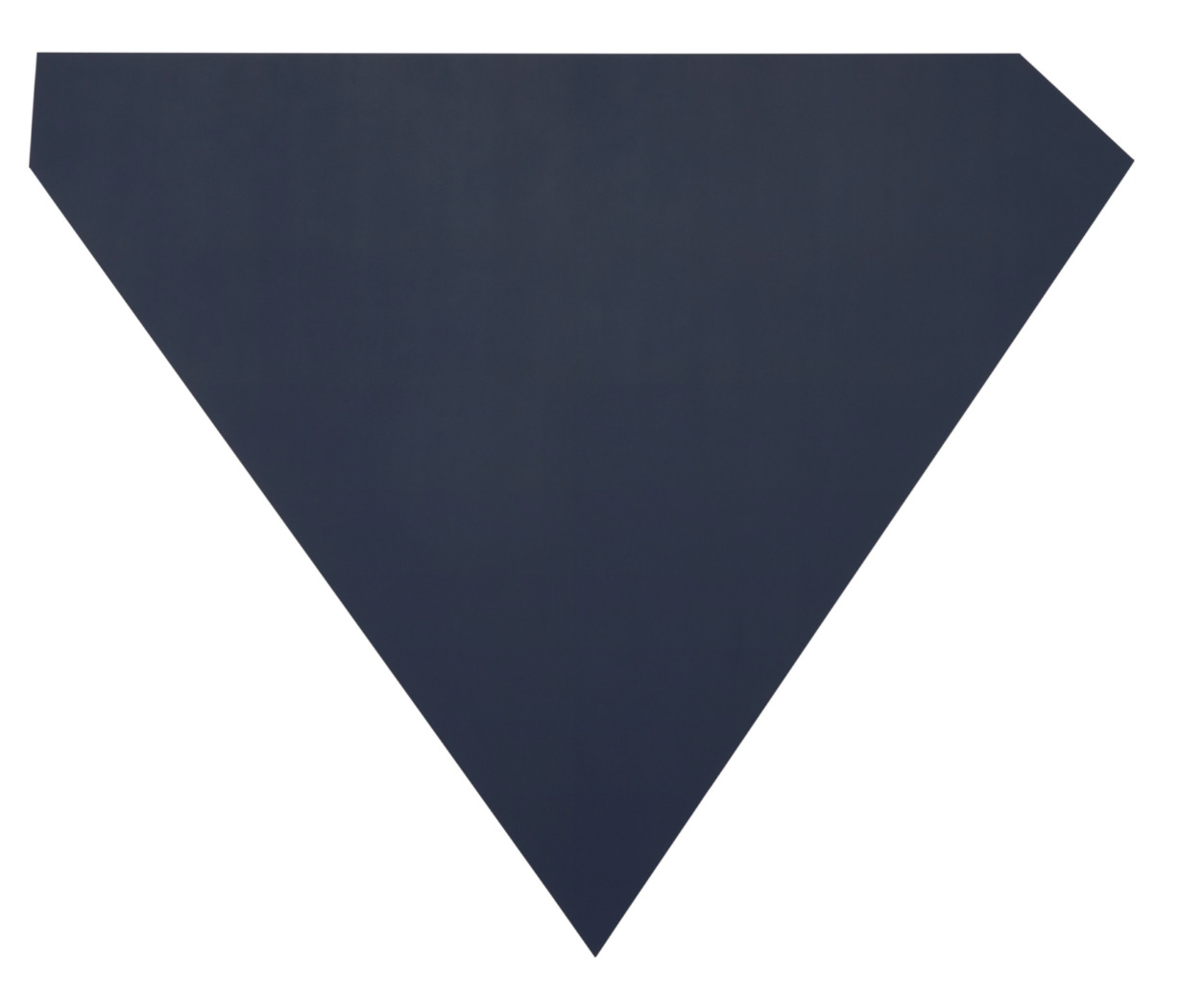
At a certain point, you never really think that you need to see another Ellsworth Kelly. His work is so “minimal” that you think you know what you’re going to see before you see it. That’s not the case though. Kelly is one of the greats. The irony of his work is that as simple as it seems, it’s never purely conceptual: it’s purely perceptual. (It’s only conceptual in your recollection [or reproduction]). The simpletons, rubes, philistines, haters, and losers always think that Kelly is merely a provocateur, and they could not be more wronger. And so, his work can surprise you even when you think you know exactly what you’re expecting. Which you think you do, since his work is relatively ubiquitous in museum collections. That isn’t to say that every Kelly is equal but that kind of proves my point. To wit, this show feels like refugees from Blue Chip storage. The work speaks for itself but as a curatorial statement it’s whatever. In general, though, they always feel as fresh as the day they were born. Here, the big surprise is Dark Blue Grey (1980-81). What a weird shape, even for a Kelly. Something about those weird, divergent, asymmetrical, top-corners sends me. What do you even call this thing? What kind of maniac thinks this stuff up? Secondly, the scale makes its force, as a form, felt. At 106 × 129½ inches, it’s larger than you, but in a way which feels exciting rather than dwarfing. That is, it’s not grandiose, it’s just big in a fun way. It’s exactly the right size for this precise polygonally queer mutant diamond. Bigger is always better unless you’re just showing off. As per the Milton Avery review above, doing very little but doing it just right is a good recipe. Specificity is everything.
Loved the Trecartin review—hilarious. The McCarthy one confused me because you say he is bad at painting but then seem to say only good things about the painting pictures (which I happen to like)…? I believe you I just need specificity!! And maybe I’m a hater but I find your negative reviews deeply satisfying. Fuck shiny plastic art.